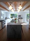
Have you seen in Magazines where they do high and low features? Where one room is filled with over the top priced items and the other is filled with more modestly priced.. Well I love them, specifically because I don't believe that beautiful design has to come with a huge price tag. If you learn anything from this blog at all, that is what I would want it to be..
So check out this high and low ..
Can you guess which is the low?? The first one is the low!
Low= 4,000
High=10,000
Amazing right.. If you want the resources they are here
Wednesday, March 30, 2011
Subscribe to:
Post Comments (Atom)


4 comments:
This is amazing!!! Thanks so much for the post! I am a sucker for gold finishes paired with pink- and this also just goes to show that chic doesn't have to be expensive!
abodelove.blogspot.com
You tricked me...I thought the first was high..well done!
What a great colorful corner! I love these kind of features. It really proves you have to have to do your research!!
Love this. Normally I'm really good at figuring out high/low, but today I was stumped. I kept going back and forth.
Post a Comment